Menu

Dever Blog

What Is the Difference Between Vector and Raster Graphics?

Perhaps your designer just asked for a vector file of your logo, or you have a banner ready for output, but the printer insists that the graphics are too “low-res” and asks for high-resolution images. It sounds so complicated when you don’t comprehend the lingo, but it is simple to tell vector and raster graphics apart once they are dissected. Let’s take a closer look at these two graphic formats.

Both vector and raster graphics are used in printed pieces and digitally on screens, but they are built differently.


What are vector graphics?

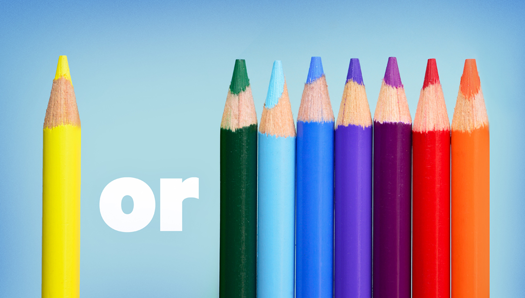
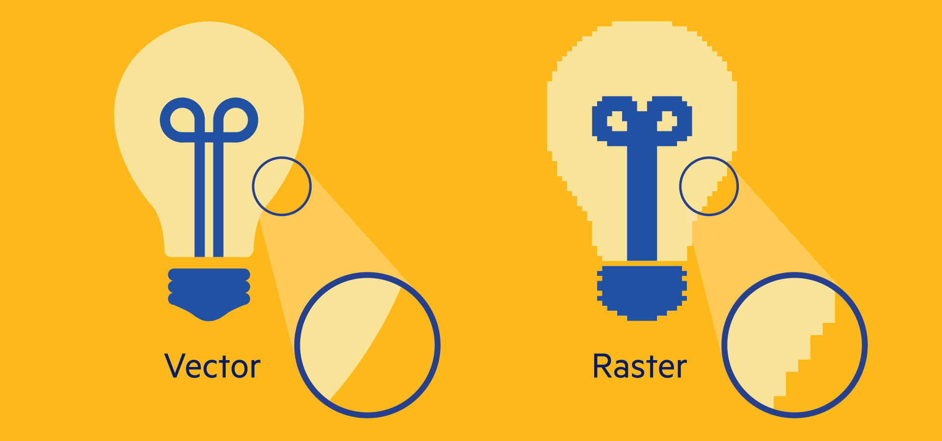
Vector graphics are created from mathematical paths, curves, and points. This produces a sharp, clear edge. Vector graphics are able to scale up or down infinitely without losing quality, so they retain the same crispness when printed on something as small as a business card or as large as a billboard. But, unlike raster graphics, vector graphics usually cannot achieve photo realism.

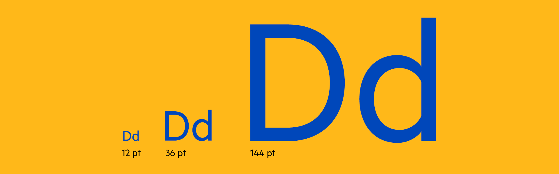
Fonts are the most commonly used vector graphics, and they demonstrate how well vector graphics scale. Look at the different sized letterforms below to see how the clean edge holds up at all sizes.


Where are vector graphics used?

Vector graphics are used in text, logos, illustrations, symbols, infographics, charts, and graphs. They are created and edited in computer programs such as Adobe Illustrator. Typical formats for a vector file are .ai (Adobe Illustrator file), .eps or .pdf. However, not all .eps or .pdf files are automatically vector-based. To understand why, we need to explore raster graphics.


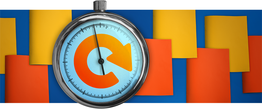
What are raster graphics?

Raster graphics are made up of numerous of tiny squares called pixels. Each square represents a different color or lightness. These pixels are arranged in a grid. When zoomed out, this tightly woven grid creates a photograph or image.

The amount of pixels in an image determines its resolution. The more pixels an image contains, the more detail that is captured—and the higher its resolution; likewise, fewer pixels capture less detail and result in lower-resolution images. Resolution is measured by pixel dimension—the number of pixels that makeup the width and height of an image. A 480 x 270 pixel graphic is lower resolution than a 1920 x 1080 pixel graphic. If you’re not sure of your file’s pixel dimension, look at the file size, measured in kilobytes (KB) or megabytes (MB). Generally speaking, if a file is measured in KB, it’s low-res; if it’s 5 MB or more, it’s high-res.


Technically Speaking:

DPI and PPI are two terms that are used to reference raster graphic resolution. They are confusing because they have been used interchangeably, but they are not the same.

DPI – Dots Per Inch. DPI is used in the printing process, and it describes the number of dots a printed document has per inch. In a printed image the more dots, the higher quality the printed piece is.

PPI – Pixels Per Inch. PPI is used digitally, and means the number of pixels your digital image has per inch on your screen.


Where are raster graphics used?

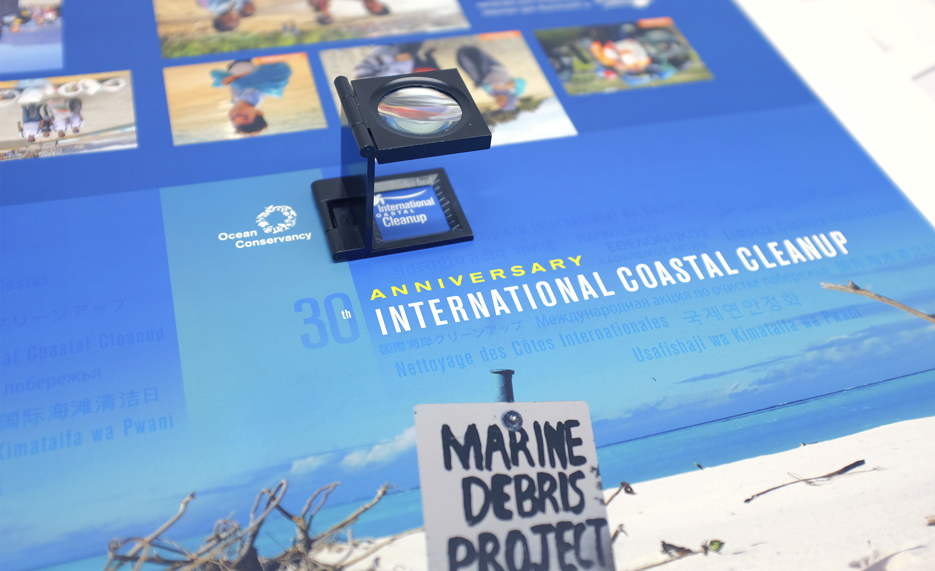
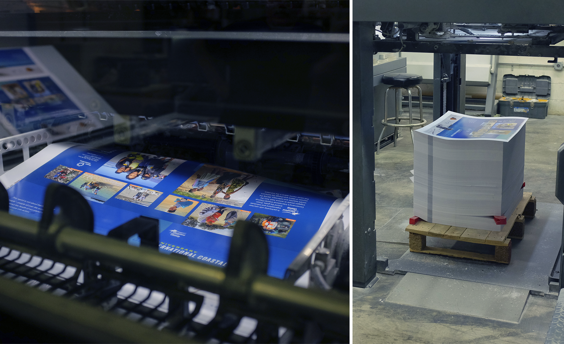
Photographs and scanned images are the most common examples of raster graphics. Raster graphics often show more subtle changes in color, tone, and value than vector graphics are able to achieve. Unlike a vector graphic, it is impossible to take a small raster graphic and scale it up without losing image quality.

Raster graphics or images are captured by a digital camera or scanned into the computer and edited by programs such as Adobe Photoshop. Typical file formats include .jpg, .psd, .png, .tiff, .bmp, and .gif. However, both raster and vector graphics can be saved as .eps and .pdf.

So, how can you tell if an .eps or .pdf is really a vector graphic? If you don’t have Illustrator or Photoshop, you can zoom in on a file and check to see if the graphic retains a clean edge (vector) or becomes jagged (raster).

So, the next time you are asked to provide a vector logo to your graphic designer or a high-resolution image to your printer, you can relax because you know exactly what to give them.

If you have further questions about these graphic formats contact Dever Designs by email or call us at 301-776-2812.

Freelancer or Studio – What’s the Right Fit for Your Project?


With the number of freelance graphic designers on the rise, there are more options than ever for outsourcing your design project. Freelancers can be a great option for certain organizations, but what makes working with a freelancer different than working with a studio? And, how do you know which one would be a better fit for your organization or project? Let’s explore the differences.

1. Budget

Let’s address the elephant in the room up front. Freelancers often cost less than a studio would for the same project. This is because freelancers have much lower operating expenses than studios do. In a studio environment, the expense of staff payroll, electricity, rent, software licensing, etc. means that it simply costs more to do business. While a lower price is appealing to many, it’s best to understand the trade-offs that come with it.

2. Timelines

Full time freelancers may be able to turn small projects around quickly, but if a freelancer only works on nights and weekends, you may have to get in line for even small projects. A studio can often handle large projects faster by assigning a team to them—taking the “divide and conquer” approach.

3. Redundancy and Backup

If your freelancer goes on vacation or has an illness, you may be having to look for a backup designer on your own. Studios can assign the project to another member of their design team to keep it on track.

Studios also have collective experience and a technical knowledge-base that is greater than most individuals. If there’s a problem with the file, chances are that there’s someone in the office who has encountered a similar issue before and knows how to fix it.

4. Quality Control

In a design studio, art directors are trained to look for consistency and quality of work.  Our studio even has a “second set of eyes” policy where a designer who hasn’t worked on the project reviews all files against a checklist to ensure things aren’t missed before printing. While there are many capable freelancers, the lack of team support could lead to inconsistency in quality.

5. Accountability

If something goes wrong, and the freelancer isn’t cooperative, there’s no creative director to turn to for help.

6. Scale
One of the things that a studio can do well is look at the big picture. For instance, a full rebranding is a significant undertaking, with many factors of future use and functionality taken into consideration. A studio can assign a team of designers to work on the resulting applications and collateral while an art director ensures consistency in establishing standards. The support of a team can help keep a large project like this on schedule.

Is it worth paying a bit more for the different level of services that a studio can offer? That’s something only you can answer.

If you’d like to explore how Dever Designs can serve you, get in touch to start the conversation.

Reinventing the Annual Report

annl-blog_art_v2

Blame it on the stock market.

According to Investopedia, legislation enacted after the 1929 stock market crash was the genesis of the annual report. What began as a staid vehicle for reporting corporate operations and overall fiscal health to shareholders has evolved; in the right hands, an otherwise dry annual report can become a sophisticated, multipurpose business tool.

Purpose
Maybe your business has to provide an annual report, but that legal requirement presents a perfect opportunity to reach out and promote your organization. Depending on how your content is presented, your annual report can be used for marketing, fundraising, team building, and recruitment purposes.

  • Introduce your organization — Share who you are and what you do with legislators or potential members, exhibitors, or corporate sponsors.
  • Demonstrate social responsibility — How your organization interacts with the broader community and the positive impact of that engagement reveals interests beyond making profits.
  • Express corporate values — Where your organization stands on issues such as the environment can influence contributors or potential members.
  • Humanize your organization — Sharing staff photos, individual stories, or other aspects of the corporate culture makes your business more approachable.
  • Energize and inspire — Recounting the year’s achievements and announcing strategies for future growth generates pride, excitement, and media buzz for your organization.

Presentation
The rapid adoption of mobile devices and social media have forced businesses to rethink how they communicate with their customers or members. Consider this:

Today’s annual reports convey more than financial data, and organizations are repackaging that information to take advantage of digital trends and opportunities. Annual report microsites with a mobile-first design appeal to digital natives but may feel foreign to your traditional demographic; using both digital and print channels allows you to target a younger audience without alienating your base. Digital variants may also allow you to introduce interactivity or motion to enhance the user experience or provide additional online-only content. A multichannel approach for your report engages readers in different ways to expand your organization’s reach.

Whether your annual report is represented online by a PDF, flipbook, microsite, or video presentation, don’t dismiss the power of print. Thoughtful, deliberate design can produce a physical report of enormous impact.

  • Format — Will your report be a bound booklet or a folded tabloid? Take advantage of unusual sizes or unique folds; the unexpected makes a memorable impression.
  • Content — Language, visuals, and corporate personality are the pillars of your brand; well-designed infographics tap into all three to convey complex ideas that resonate with a younger or lay audience.
  • Techniques and finishes — From paper and ink to “sensory printing” techniques—like tactile coatings or thermal technologies—every choice you make for your annual report speaks volumes about your organization.

In print and online, a professional design partner can help you think outside the box and turn your annual report into a multitasking powerhouse.

Ready to reinvent your annual report? Get in touch with Dever Designs to start the conversation.

Inspiration, Forecast or Trend


Grass & Leaves graphic


Recently, the Pantone Color Institute™ announced with much fanfare their “Color of the Year”. The ordained hue for 2017 is “Greenery”, which they describe as a “fresh and zesty yellowish green”, one of “nature’s neutrals”. Since 2012, this division of Pantone® has annually selected and promoted an individual color to the design industry for the coming year.

Just across the river in Alexandria, Virginia, the Color Marketing Group was established in 1962 as a not-for-profit international association for “color design professionals”. Both groups offer a range of services that analyze, forecast, and consult on color trends. This is a real asset to the designers, manufacturers, and marketers of the next generation of consumer goods. A brief survey of the past few decades illustrates these trends, reflected in everything from automobiles and make-up to fashion and home furnishings, as prominent colors burst into the marketplace only to fade away as passé.

There is a direct correlation between how successful or trendy a color is in the marketplace and how soon it will fade and be seen as out-of-style, old. The short life cycle of trends, including colors, are the lifeblood of manufacturers and marketers hawking lifestyle goods and services. They survive by inventing and promoting the next big thing we all must have. While identifying and exploiting color trends works well for the fast-paced consumer goods industry, it may be short sighted for long-term brand building in the less volatile world of non-profits, associations, and institutions.

Here’s where your design team can help by offering expert advice and consultation. What are the mission and vision of your organization, and how might your brand’s color choices reflect those values? Is it time for an evolution of your brand, or merely time to refresh and support an existing legacy identity? Careful consideration might also be given to the psychology of colors, or the international perception of certain hues in different cultural contexts. For example, the color of good luck is red in China, but it is green in the Middle East; in Indonesia, however, green is “the forbidden color”.

Color is one of the most powerful communication tools in graphic design. Use it wisely to differentiate and distinguish your organization, and not merely to be caught up in the latest fad.

“Neither a leader nor a follower be”

—with apologies to Shakespeare

Looking for some guidance on how color can enhance your identity? Email or call us at 301-776-2812 to start the conversation.

Got the Budgeting Blues?

budget-planning


As 2017 approaches and you begin to think about institutional goals and initiatives for the coming year, pay special attention to those large, looming projects on the not-so-distant horizon. In times of transition, shifting priorities may impact funding levels and sources. Allocating your organization’s resources wisely becomes more important than ever during these periods of change.

Just as big-ticket household items make a big dent in your personal finances, large projects such as membership drives, conferences, and annual reports may require a significant portion of your organization’s annual budget. By engaging outside partners or vendors now, you can take advantage of their expertise to help you develop preliminary budgetary figures for those substantial and critical initiatives.

A truly collaborative creative partner is invested in your success and serves as an ally during the budgeting phase. Putting their knowledge and network of resources to work for you early in the process, an experienced designer can propose innovative solutions and estimate these approaches to arm you with realistic figures to share with boards, committees, or other decision-makers within your organization. These initial discussions not only help you understand and plan for the real-world costs involved, but may also energize your team and ignite interest and buy-in for specific initiatives.

Experienced design studios can help you maximize ROI by:

  • Facilitating candid conversation among key leadership to define objectives, outline strategies, and build consensus to move forward;
  • Assessing current materials and resources to see where and how existing elements may be reused or repurposed to meet future needs;
  • Thinking creatively to generate cost savings and get the biggest bang for your buck.

Depending on the project, there are numerous ways to stretch your dollars. Producing postcards to advertise an event? Consider developing both a save-the-date and reminder mailing now and gang printing both cards at once. Need furnishings for a large-scale exhibit? Get an accurate count as quickly as possible and order in advance to get the best selection and avoid rush fees. Trust your design partner to tailor their cost-saving suggestions to meet your needs.

Let Dever Designs estimate, design, and produce your next large project—and shake off your budgeting blues. Get in touch to start the conversation.

Magazine Redesign – A Tailored Fit

pexels-photo-28764_post2

Part 2 – Where do I start?

In Part 1 we covered when the time is right to consider a magazine redesign. In this post, let’s explore how to get started. The key is a careful collaborative partner – one who will ask the right questions and facilitate a process to define and reach your publication’s goals.

  • Review – Schedule enough time for a thorough and thoughtful audit and critique of your existing publication. Review what aspects of your magazine really work well, and which ones require a tune-up or even possible elimination. Consider what new features might enhance your readers’ experience and potentially grow your audience.
  • Plan for Evolution – Consider how your magazine might change over the next several years. Does your publication have a digital edition? Will you require an app or a web-based platform? Anticipating these issues will allow you to design a magazine brand that can transition well as publishing technologies evolve.
  • Refine and define – With the knowledge you’ve gathered, refine your vision and define your goals. Be precise while outlining the specifications but allow space for your design team to explore creative solutions while meeting your expectations. Remember, the better a problem is defined, the clearer the solutions become.
  • Consult the experts – Engaging the right creative team with a range of magazine and publication experience is key to a successful outcome. Whether you’re launching a new magazine or bringing a successful existing brand up-to-date, a knowledgeable collaborative partner can guide the process and advise on best practices.

At Dever Designs we work closely with clients, guiding them through a facilitated process to analyze, define, and deliver superior publications. From turn-key magazines, to templates and style guides for in-house design teams, we have the expertise to take your publication to the next level. Get in touch to start the conversation.

Magazine Redesign – A Tailored Fit

pexels-photo-28764

Part 1 – When’s the right time?

For most associations, a print magazine remains the number one member benefit, especially when supplemented with additional online content. The decision to redesign your magazine is one that demands careful consideration, given the investment of time, effort and resources required to do it right. But how do you know when the time is right?

  • When you look old – While the typical life-cycle of a trade publication may be from 3 – 10 years, you know when the look, feel, and function of your magazine feels antiquated.
  • When you’re out of sync – Communicating, surveying and keeping your finger on the pulse of your readership will keep you informed. When you no longer resonate with your primary audience demographic, or can’t reach new potential subscribers, you’re overdue.
  • When you’ve evolved – If your organization or publication has gone through significant editorial, functional, or structural changes, your magazine can lead the way to educate and inform your audience on how they will benefit. A redesign can create a focal point for signaling that evolution and increasing consumer “buy in”.
  • When you rebrand – In a marketplace where organizations merge or form new collaborative partnerships, a rebranded publication can clarify and crystalize new opportunities created by such joint ventures. A rebrand can also do an excellent job of repositioning an organization that needs to distance itself from an unfortunate history.

In Part 2, we’ll explore how you start the redesign process.

At Dever Designs we work closely with clients, guiding them through a facilitated process to analyze, define and deliver superior publications. From turn-key magazines, to templates and style guides for in-house design teams, we have the expertise to take your publication to the next level. Get in touch to start the conversation.

7 Tips to Strengthen Your Marketing Campaign

fish-icon-01_sm


Two to four seconds. That’s about all the time you have to capture someone’s attention with your online or direct mail promotion.

That means before anyone even reads this sentence, they have already made a decision on whether or not to engage with your content.

With that in mind, we have compiled seven tips to help boost your marketing efforts.

  1. Swim Against the Tide. If you want to stand out against the sea of email heading to your audience’s inbox every day, consider targeting their mail box instead. Direct mail can offer an intimate way to connect with your audience as people open their mail and place it on their coffee table or refrigerator and share it with others.
  2. Variety is the Spice of Life. While direct mail is a great option, we know it takes several touches for a potential customer to take action. Because of that, approaching them through direct mail, social media, email marketing, etc., spreads the marketing to different areas and doesn’t overwhelm your audience in one medium.
  3. Less is More. People have short attention spans. They only read so much. The more succinct you can be in relaying a clear message and giving your audience that motivation to act, the better.
  4. Have a Clear Call to Action. The last thing you want is your audience wondering “So what do you want me to do?” Make it easy for people to see what you want, why they need you and why they should want to work with you or buy your product. How can you make their life better?
  5. Consistency is Key. The audience should be able to recognize a campaign as coming from your organization through consistent branding, graphic treatments, photography, and messaging. While the campaign should be a reflection of your overall brand, it can have its own sub campaign brand that complements the organization’s parent brand.
  6. All About Balance. Whether the duration of your campaign is lengthy or short, it takes multiple touches for someone to remember who and what you are. However, as you reach out to your audience, be cognizant not to chase away the very people you’re trying to attract. There’s a balance between multiple touches and overwhelming your audience.
  7. Track Your Response. Since you’ll have multiple touch points for your campaign, you’ll want to know which avenue is the most successful so you can channel a greater part of your efforts in that direction. When sending out email content, add tracking links so you can see who is opening your content and when. In a direct mail piece, provide a specific call to action that lets you know if people are engaging with your campaign.

Need help creating a campaign that stands out? Get in touch today to start the conversation.

Dever Designs Teams Up With Ocean Conservancy to Talk Trash

Ocean Conservancy Reprt
Reviewing the cover press proof


If you had to guess what the most collected item of trash along the world’s beaches and waterways was in 2015 was, what would you say?

Would your guess be bottle caps? Perhaps plastic bags?

It turns out that in 2015, through Ocean Conservancy’s International Coastal Cleanup, volunteers collected 2,127,565 cigarette butts.

For 30 years, Ocean Conservancy’s International Coastal Cleanup has engaged people to clean trash from beaches and waterways spanning the globe. In 2015 alone, more than 18 million pounds of trash was collected by nearly 800,000 volunteers as part of this effort.

Dever Designs was proud to help highlight the scale of the organization’s work in a visually engaging format as we partnered with Ocean Conservancy on their 2015 Ocean Trash Index.

To help illustrate their story and accomplishments in a compelling way, we first changed up the 8.5” x 11” report format to an 11” x 9” horizontal size, giving the report more of a coffee table book feel. We incorporated feature photos and quotes from volunteers to help tell the organization’s story, while designing powerful infographics to quantify the impact of the International Coastal Cleanup.


Ocean Conservancy Report
The first sheets, fresh off the press


Ocean Conservancy distributed the report on their website and in print to the cleanup coordinators around the world. The print copies were produced with crisp details and bright colors by our partners at Cavanaugh Press on their 40” 6-Color Heidelberg Speedmaster 102 press.

Working with organizations that make the world a better place is something that energizes us to do our best work. We were honored to help Ocean Conservancy highlight the 30th anniversary of its International Coastal Cleanup.

Click here to see the finished piece.

See how we can help your organization spread the word. Take a look at our portfolio and get in touch to start the conversation.

Infographics Speak Volumes

Infographics come in all shapes and sizes. Some are more whimsical and illustrative, while others take a more simplified format. No matter what type of infographic you choose to use, all can help convey a message to your audience in a visually interesting way.

Some of the benefits of using an infographic include:

  • Capture a reader’s attention quickly
  • Help break up text-heavy reports
  • Succinctly convey your message
  • Easily repackaged and shared across various platforms
  • Useful tool to convey financial information and statistics
  • Serve as a portal to additional information

If you’re looking to create a cost effective graphic that’s more visually appealing than simply presenting a spreadsheet, you can go the route of a pie chart, bar graph or scatter graph. Data-heavy information translates well in this format and makes complex information more easily digestible for your audience.


Pie Chart


This type of infographic is also an engaging tool for a nonprofit organization striving to be financially transparent to donors without having the reader dig through a spreadsheet.

On the opposite end of the spectrum is the more illustrative infographic that takes what could be considered “dry” data and makes it come alive through illustrations, comparisons, telling a story or explaining a process.

For example, in this infographic from their annual data report, Ocean Conservancy visually shows the audience the story of how sea life is affected by trash.


10_Entangled_Animals-01


This type of narrative creates more of an emotional appeal, which is an effective way of reaching the Ocean Conservancy audience.

Whether you’re creating a data-driven graphic or one that is more of a emotional narrative, it’s important to focus on color contrast, clarity and simplicity to ensure it is easily accessible. Creating a successful infographic for print, a website, social media or a mobile platform means knowing your audience and being clear in the message you’re trying to communicate.

Looking for some help in creating infographics for your organization? Call Dever Designs at 301-776-2812.