As you begin to think about institutional goals and initiatives for the year ahead, pay special attention to those large, looming projects on the not-so-distant horizon. In times of transition, shifting priorities may impact funding levels and sources. Allocating your organization’s resources wisely becomes more important than ever during these periods of change.
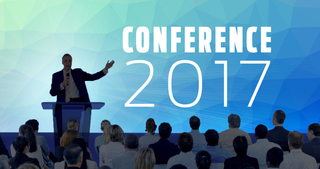
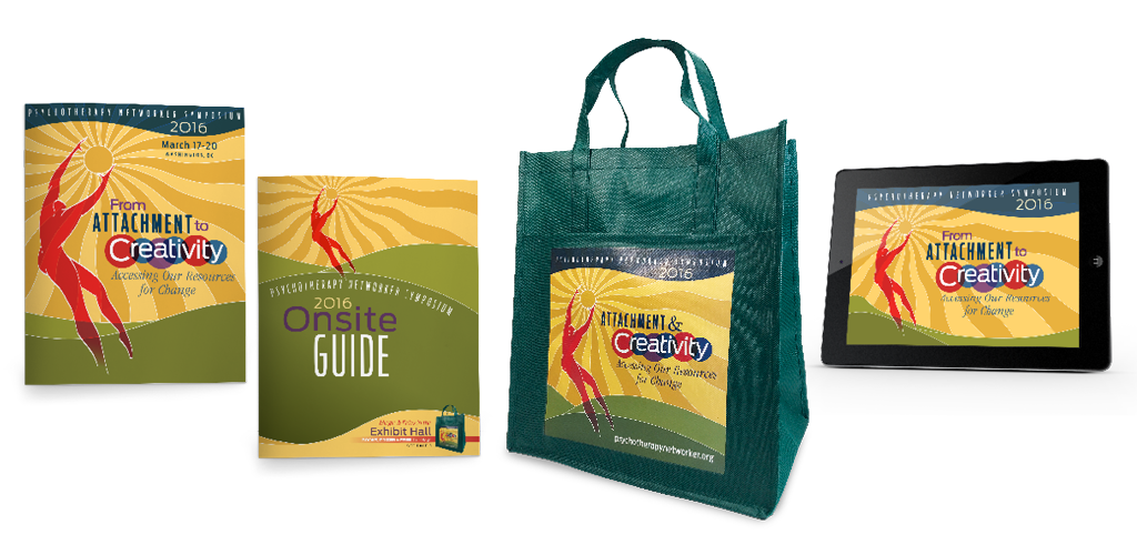
Just as big-ticket household items make a big dent in your personal finances, large projects such as membership drives, conferences, and annual reports may require a significant portion of your organization’s annual budget. By engaging outside partners or vendors now, you can take advantage of their expertise to help you develop preliminary budgetary figures for those substantial and critical initiatives.
A truly collaborative creative partner is invested in your success and serves as an ally during the budgeting phase. Putting their knowledge and network of resources to work for you early in the process, an experienced designer can propose innovative solutions and estimate these approaches to arm you with realistic figures to share with boards, committees, or other decision-makers within your organization. These initial discussions not only help you understand and plan for the real-world costs involved, but may also energize your team and ignite interest and buy-in for specific initiatives.
Experienced design studios can help you maximize ROI by:
- Facilitating candid conversation among key leadership to define objectives, outline strategies, and build consensus to move forward;
- Assessing current materials and resources to see where and how existing elements may be reused or repurposed to meet future needs;
- Thinking creatively to generate cost savings and get the biggest bang for your buck.
Depending on the project, there are numerous ways to stretch your dollars. Producing postcards to advertise an event? Consider developing both a save-the-date and reminder mailing now and gang printing both cards at once. Need furnishings for a large-scale exhibit? Get an accurate count as quickly as possible and order in advance to get the best selection and avoid rush fees. Trust your design partner to tailor their cost-saving suggestions to meet your needs.
Let Dever Designs estimate, design, and produce your next large project—and shake off your budgeting blues. Get in touch to start the conversation.