Menu

Dever Blog

Brand It, and They Will Come

Conference Branding


When you’re hosting a conference, you want to make an impact on your community of attendees and members. You focus on making your workshops educational and helpful. You pull out all the stops to book keynote speakers who draw crowds and inspire. You look at both the big picture and the details when it comes to the content of your conference, but what about its design and branding?

One way to make a big impact on both your marketing effort and attendee experience is to develop and implement a conference brand that is clear, unique, and instantly recognizable. Using consistent brand applications from the first point of contact—such as a save-the-date post card and email—through the on-site experience…to post-event surveys means that you’re building awareness, generating excitement, and fostering institutional pride and credibility at every step of the communication process.

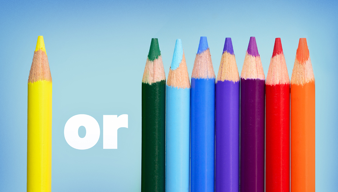
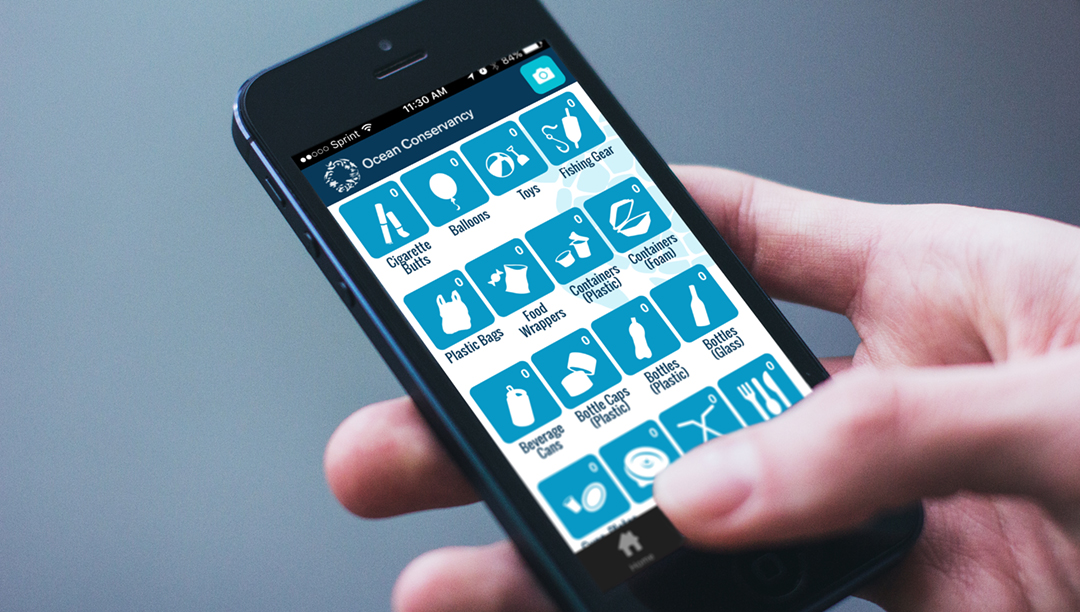
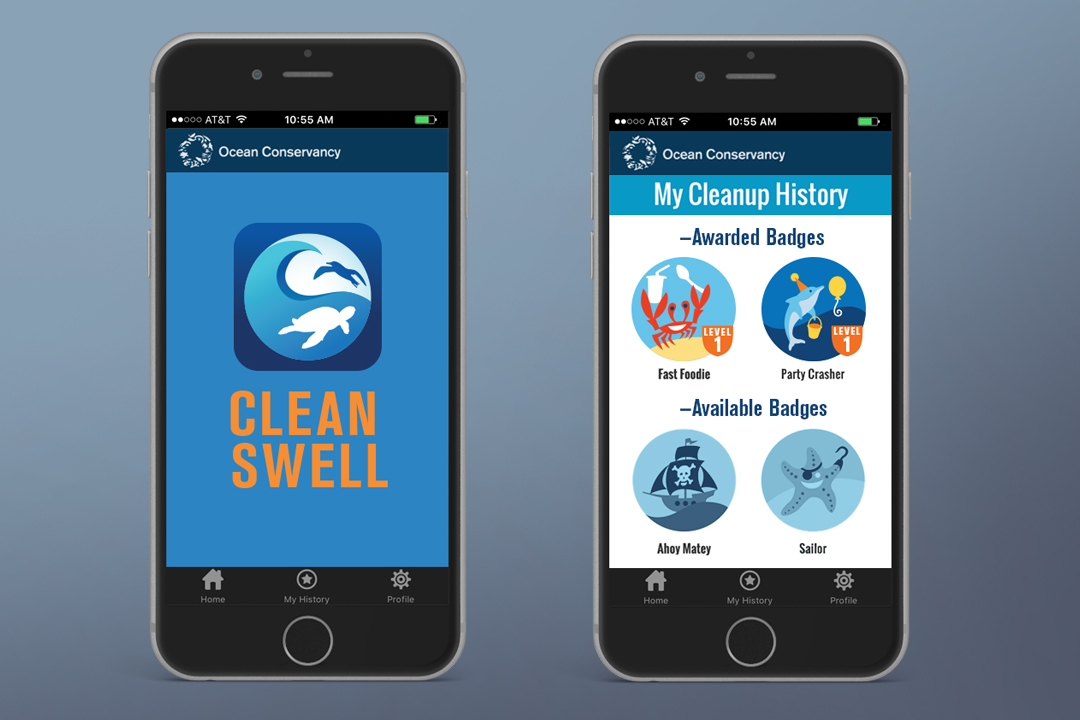
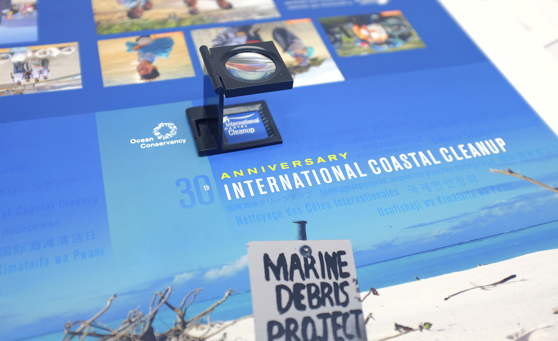
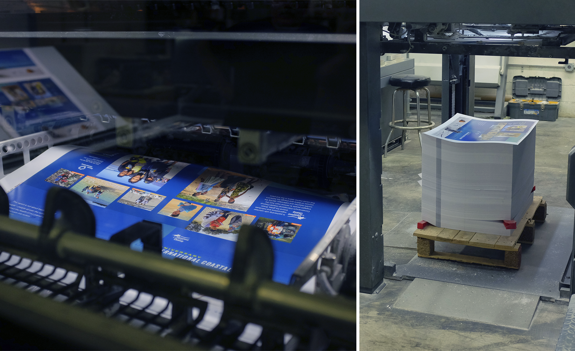
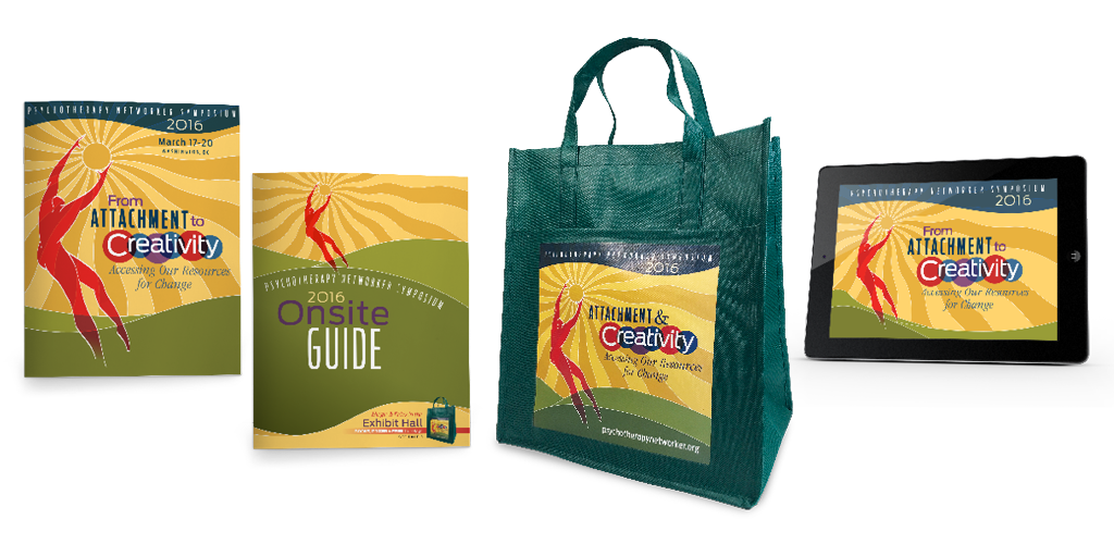
So, what makes a successful conference brand? For starters, it’s more than a logo. The best conference brands are packages that include flexible graphics that can be applied across every medium. From direct mail to t-shirts, on-site signage to slide decks, consistent and expertly applied graphics, colors, and type treatments go a long way to build recognition and set a professional tone for your conference.

Next, your theme language is every bit as important as the graphics but is often overlooked and undervalued. While some go for a clever turn of phrase, it’s important to think about how your language addresses your audience’s pain points. Help them see the benefits that your conference provides and give them a sense of the atmosphere of the event through the tone and choice of your words.

Call us today at 301-776-2812 to start the conversation about how we can develop a conference brand that makes your organization stand out in the crowd.

Freelancer or Studio – What’s the Right Fit for Your Project?


With the number of freelance graphic designers on the rise, there are more options than ever for outsourcing your design project. Freelancers can be a great option for certain organizations, but what makes working with a freelancer different than working with a studio? And, how do you know which one would be a better fit for your organization or project? Let’s explore the differences.

1. Budget

Let’s address the elephant in the room up front. Freelancers often cost less than a studio would for the same project. This is because freelancers have much lower operating expenses than studios do. In a studio environment, the expense of staff payroll, electricity, rent, software licensing, etc. means that it simply costs more to do business. While a lower price is appealing to many, it’s best to understand the trade-offs that come with it.

2. Timelines

Full time freelancers may be able to turn small projects around quickly, but if a freelancer only works on nights and weekends, you may have to get in line for even small projects. A studio can often handle large projects faster by assigning a team to them—taking the “divide and conquer” approach.

3. Redundancy and Backup

If your freelancer goes on vacation or has an illness, you may be having to look for a backup designer on your own. Studios can assign the project to another member of their design team to keep it on track.

Studios also have collective experience and a technical knowledge-base that is greater than most individuals. If there’s a problem with the file, chances are that there’s someone in the office who has encountered a similar issue before and knows how to fix it.

4. Quality Control

In a design studio, art directors are trained to look for consistency and quality of work.  Our studio even has a “second set of eyes” policy where a designer who hasn’t worked on the project reviews all files against a checklist to ensure things aren’t missed before printing. While there are many capable freelancers, the lack of team support could lead to inconsistency in quality.

5. Accountability

If something goes wrong, and the freelancer isn’t cooperative, there’s no creative director to turn to for help.

6. Scale
One of the things that a studio can do well is look at the big picture. For instance, a full rebranding is a significant undertaking, with many factors of future use and functionality taken into consideration. A studio can assign a team of designers to work on the resulting applications and collateral while an art director ensures consistency in establishing standards. The support of a team can help keep a large project like this on schedule.

Is it worth paying a bit more for the different level of services that a studio can offer? That’s something only you can answer.

If you’d like to explore how Dever Designs can serve you, get in touch to start the conversation.

Jeff Dever on Leadership Philosophy with Martin O’Neill


Jeff Dever, the founder, President and Creative Director of Dever Designs recently had the opportunity to sit down with Martin O’Neill to discuss how he balances the demands of leadership within the framework of a full service graphic design firm.

An App with a Purpose

mockup


We believe the right time to build an app is when it can be useful for your audience by promoting engagement and solving a problem.

Clean Swell, an app by Ocean Conservancy, does just that. During annual cleanups and throughout the year, volunteers had to fill out thousands of paper data collection forms and add up the totals themselves. To help streamline that process, Ocean Conservancy created an app to allow users to tap on an item collected and automatically keep tallies. The data collected instantly uploads to Ocean Conservancy’s global ocean trash database. This data delivers a global snapshot of ocean trash, providing researchers and policy-makers insight to inform solutions.

Dever Designs was initially tasked with the creation of the main app icon along with buttons representing the range of trash found on beaches. With a more recent update, we had the opportunity to illustrate whimsical badges that can be earned by the users for certain quantities and types of trash collected. This “gamification” encourages volunteers to gather more trash in order to achieve higher levels within the app.


mockup2


While working on the graphic icons and elements for CleanSwell, we focused on creating pieces that fit within the Ocean Conservancy brand and tied through to the Global Trash Index Report we designed. This creates a continuity between the users’ experience in the app and their other interactions with the Ocean Conservancy.

We were proud to partner with Ocean Conservancy on an app that empowers people to take action in contributing to a cleaner and healthier ocean.

See more of this project here.

How can we help bring your brand to life? Email or call us at 301-776-2812 to start the conversation.

Design in the Details: NAD Exhibition


For their 60th quinquennial session in San Antonio, Texas, this division of the Seventh-day Adventist Church enlisted Dever Designs to conceive, create, and produce a major exhibition. The goal was to feature how their diverse range of ministries reflected the theme Reaching North America – With Hope & Wholeness. The nearly 30,000 square feet exhibit was designed to focus on three areas of concentration – departmental ministries, media ministries, and a gallery of education. Overall, we designed and coordinated the construction and installation of over 50 separate exhibit components for more than 40 internal clients. The key to the project’s success was careful design, attentive project management and focused logistics coordination.

Take a look at the range of trade show exhibits that we’ve designed in our portfolio.

To see how Dever Designs can help you with your trade show exhibit, get in touch today.

Dever Designs Teams Up With Ocean Conservancy to Talk Trash

Ocean Conservancy Reprt
Reviewing the cover press proof


If you had to guess what the most collected item of trash along the world’s beaches and waterways was in 2015 was, what would you say?

Would your guess be bottle caps? Perhaps plastic bags?

It turns out that in 2015, through Ocean Conservancy’s International Coastal Cleanup, volunteers collected 2,127,565 cigarette butts.

For 30 years, Ocean Conservancy’s International Coastal Cleanup has engaged people to clean trash from beaches and waterways spanning the globe. In 2015 alone, more than 18 million pounds of trash was collected by nearly 800,000 volunteers as part of this effort.

Dever Designs was proud to help highlight the scale of the organization’s work in a visually engaging format as we partnered with Ocean Conservancy on their 2015 Ocean Trash Index.

To help illustrate their story and accomplishments in a compelling way, we first changed up the 8.5” x 11” report format to an 11” x 9” horizontal size, giving the report more of a coffee table book feel. We incorporated feature photos and quotes from volunteers to help tell the organization’s story, while designing powerful infographics to quantify the impact of the International Coastal Cleanup.


Ocean Conservancy Report
The first sheets, fresh off the press


Ocean Conservancy distributed the report on their website and in print to the cleanup coordinators around the world. The print copies were produced with crisp details and bright colors by our partners at Cavanaugh Press on their 40” 6-Color Heidelberg Speedmaster 102 press.

Working with organizations that make the world a better place is something that energizes us to do our best work. We were honored to help Ocean Conservancy highlight the 30th anniversary of its International Coastal Cleanup.

Click here to see the finished piece.

See how we can help your organization spread the word. Take a look at our portfolio and get in touch to start the conversation.

Infographics Speak Volumes

Infographics come in all shapes and sizes. Some are more whimsical and illustrative, while others take a more simplified format. No matter what type of infographic you choose to use, all can help convey a message to your audience in a visually interesting way.

Some of the benefits of using an infographic include:

  • Capture a reader’s attention quickly
  • Help break up text-heavy reports
  • Succinctly convey your message
  • Easily repackaged and shared across various platforms
  • Useful tool to convey financial information and statistics
  • Serve as a portal to additional information

If you’re looking to create a cost effective graphic that’s more visually appealing than simply presenting a spreadsheet, you can go the route of a pie chart, bar graph or scatter graph. Data-heavy information translates well in this format and makes complex information more easily digestible for your audience.


Pie Chart


This type of infographic is also an engaging tool for a nonprofit organization striving to be financially transparent to donors without having the reader dig through a spreadsheet.

On the opposite end of the spectrum is the more illustrative infographic that takes what could be considered “dry” data and makes it come alive through illustrations, comparisons, telling a story or explaining a process.

For example, in this infographic from their annual data report, Ocean Conservancy visually shows the audience the story of how sea life is affected by trash.


10_Entangled_Animals-01


This type of narrative creates more of an emotional appeal, which is an effective way of reaching the Ocean Conservancy audience.

Whether you’re creating a data-driven graphic or one that is more of a emotional narrative, it’s important to focus on color contrast, clarity and simplicity to ensure it is easily accessible. Creating a successful infographic for print, a website, social media or a mobile platform means knowing your audience and being clear in the message you’re trying to communicate.

Looking for some help in creating infographics for your organization? Call Dever Designs at 301-776-2812.

Behind Every Good Brand is a Good Brand Guide

Brand Guides


Your brand represents everything your organization is. It encompasses the visuals, the messaging, and even your organization’s personality. That’s why when it comes to presenting your brand to the public, you want to get it right.


Why do you need a brand guide?

As a company reveals a new or updated logo, it may seem like all employees are initially on board regarding its usage.

But what happens when Nadia in marketing is creating a new social media profile picture and skews the size of the logo to make it fit her needs? Or maybe Alex in accounting decided to have some T-shirts made for a golf fundraiser, but preferred a different shade of gold than what was approved for the logo?

When it comes to protecting, promoting and presenting your brand, consistency is key. That’s why creating and using a brand guide is so essential. A good brand guide will accommodate creativity while policing the parameters.


The Value of a Brand Guide

  • Helps maintain control of the brand
  • Helps provide direction and focus, keeping everyone on target
  • Spells out and reinforces the tone of your organization
  • Empowers employees to keep the brand cohesive

Applying aspects of your brand willy nilly or allowing employees to have a free-for-all with the logo is equivalent to not even having a brand at all. It’s essential to have and maintain brand standards that all employees will follow.


Components to the Brand Guide

A brand guide can be as in-depth as what you might imagine a company like Walt Disney would utilize, or it can be short and sweet, depending on your needs and budget.

Visual – Every element of your brand, from the logo to stationery to supporting graphic elements needs to be consistent. Colors, typography and even details such as the amount of white space around your logo, should be carefully outlined in your company’s brand guide. This guide will define the parameters within which you communicate your brand at every level.

Voice – How your organization presents its tagline or other standard language will also be outlined in the brand guide. When, and how, you use this messaging, as well as its legibility, are important aspects of branding.

Tone – Every organization has a particular way in which they interact with their audience. This can mean they take on a friendly and helpful tone or perhaps more of an authoritative, industry expert approach. The brand guide will help define your organization’s personality, which will be captured in industry messaging moving forward.

A brand guide can be distributed in print format, although, increasingly, companies are making it available in a digital format, either as a PDF or a microsite. It’s important to know that the brand guide will constantly evolve as new issues come into play. Be sure to work with your design firm to keep your brand guide up-to-date.

Want to take a fresh look at your company’s brand guide?
Give us a call at 301-776-2812.

Summer—The Perfect Time to Add Some Sizzle to Fall Projects

Summer To-Do


It’s mid-summer. You’re probably thinking about your toes in the sand or lounging poolside. While it may be difficult to maintain your focus on work, the summer is actually the perfect time to get a jump start on fall projects like your organization’s annual report, membership campaigns, and fall conferences.

Get cracking on your annual report
Tracking your organization’s achievements over the course of the year, locating the best photos and highlighting donors can seem like a daunting task. But it doesn’t have to be! Take advantage of a quiet office and slower summer pace to gather and organize news and photos from the year. This could be a great project and resume builder to pass along to the summer intern.

Think about themes that encapsulate the past year or the spirit of your organization. You can also build a theme around a large-scale event or major strategic organizational push. Talk to your design firm early to clarify what you’re trying to achieve or convey with your report. They will be able to share your organization’s story through format, graphics and production techniques.

Boosting membership
Yes it’s hot outside, but before it starts heating up in the office, begin coordinating your fall membership campaign. First, look at the data and outcomes of previous membership drives to see what methods were most effective. Plan a mix of print, digital and social media marketing. It’s important to reach out across multiple channels to ensure your audience is being reached. An email message could potentially be overlooked, while a colorful postcard may be just the piece of collateral to capture your audience’s attention. Want to target a new demographic? Try to reach them on a medium where they are actively engaged.

Fall conferences
Your big conference might take place in the fall, but it’s never too early to begin brainstorming and planning about brand collateral and more. Slow summer office days are the perfect time to work with your design firm on “Save the Date” notices you can send out ahead of schedule to keep your conference front of mind for your target market. Keep in mind it’s going to take several touches to keep guests intrigued and excited about your event. Start planning a branded email, e-newsletter, post card, etc., that clearly highlights the value of your event. Some organizations are even creating apps to communicate regularly with attendees and keep them in the loop about conference events and activities.

In addition to alerting your audience about the event, you’ll also need to create collateral to distribute to attendees once they arrive. Begin working with your designers in advance to create clear and organized programs and onsite guides that highlight speakers and workshops and offer a general awareness of what your conference has to offer.

And don’t forget the giveaways! Conference attendees get excited about tchotchkes, particularly useful items such as T-shirts, USB sticks, tote bags, hats and other apparel that your design firm can help brand to your event. Remember, the better the experience your guests have at your event, the more likely they will be to attend next year.

Dever Designs is happy to help you with your planning process. Visit deverdesigns.com or call 301-776-2812.

Top 5 Client Pet Peeves in Working with Designers

PetPeeves


On our survey at the ASAE MM&C Conference this year, we asked what the biggest pet peeves are in working with designers. We thought the results were worth sharing. Let’s count down the top 5 most common concerns and how we aim to avoid them here at Dever Designs.

5. Lack of attention to detail

We make every effort to meet or exceed your expectations by listening, verifying, and reviewing at every stage. Our practice of anticipating next-steps and being proactive when managing vendors makes your life easier throughout each project. We even have a second designer review every job that goes out the door for quality control.

4. Prices are too expensive

Our goal is to make your investment go further by looking for ways to save you money throughout each project. For example, when designing an exhibit display, we’ll recommend hardware that could be rented or purchased and resold, depending on your needs. Our estimates reflect the time it takes to design and produce a project, based on past experiences. If the project goes more quickly than estimated, we’ll give you a credit for the unused time.

3. Lack of listening and understanding our organization

At the beginning of each project, we make it a point to gather all of the stakeholders together and establish clear goals for the job. This creates an environment in which we can fully understand your organization’s needs. With consensus achieved, we propose solutions that integrate the input of those involved.

2. Lack of creativity and quality design

Using the information that we gather by listening to all of the stakeholders, we consider what unique approach would best serve your audience. With our experienced team of designers, we propose multiple concepts in order to create a quality solution that’s right for your organization.

And now for your top pet peeve…

1. Slow responses and missed deadlines

Each of our designers is also a project manager, which means that clients get to work directly with those producing their project—no account executives acting as middle-men to slow things down. At the start of each project, the designers will lay out a realistic schedule that works backwards from your deadline.

Interested in talking with us about how we can solve your design pet peeves? Just get in touch and start the conversation.