Menu

Dever Blog

What’s Up with Colors? Color modes explained.

Your company just got a new brand standards guide. The brand color page lists several complex numeric formulas for each color swatch — CMYK, Pantone®, RGB, and HEX. What are these formulas for, and how do you use them?

These formulas are a set of numbers used to create a desired color. Each color mode renders very differently and is set up for a specific use. CMYK and Pantone® are for print, RGB and HEX are for onscreen.


Colors In Print

CMYK is used for printed materials. CMYK (aka, 4-color process) is short for Cyan , Magenta , Yellow and Black ♦ — the four process inks used in color printing. In CMYK, colors are built one printing plate at a time using dots of these inks. Each of the four plates prints one color. A build-up of dots of these four ink colors achieves a wide variety of colors.

Why is Black a K? At one time, the plate with the black ink was referred to as the “Key” plate because it carried the key information and details of the printed piece. This is why black is referred to as K and not B. B could also be confused as “blue”, as in RGB.

Print is subtractive and deals with the absorption and reflection of light. When all the colors are subtracted from each other the outcome is no ink. Printing has a more limited color range than the web. This is why printed color performs differently on paper (reflective) than what is on your computer monitor (back light).

CMYK does not have white ink, because it is assumed that it will be printed on white paper. Therefore, colors will perform differently on colored stock.

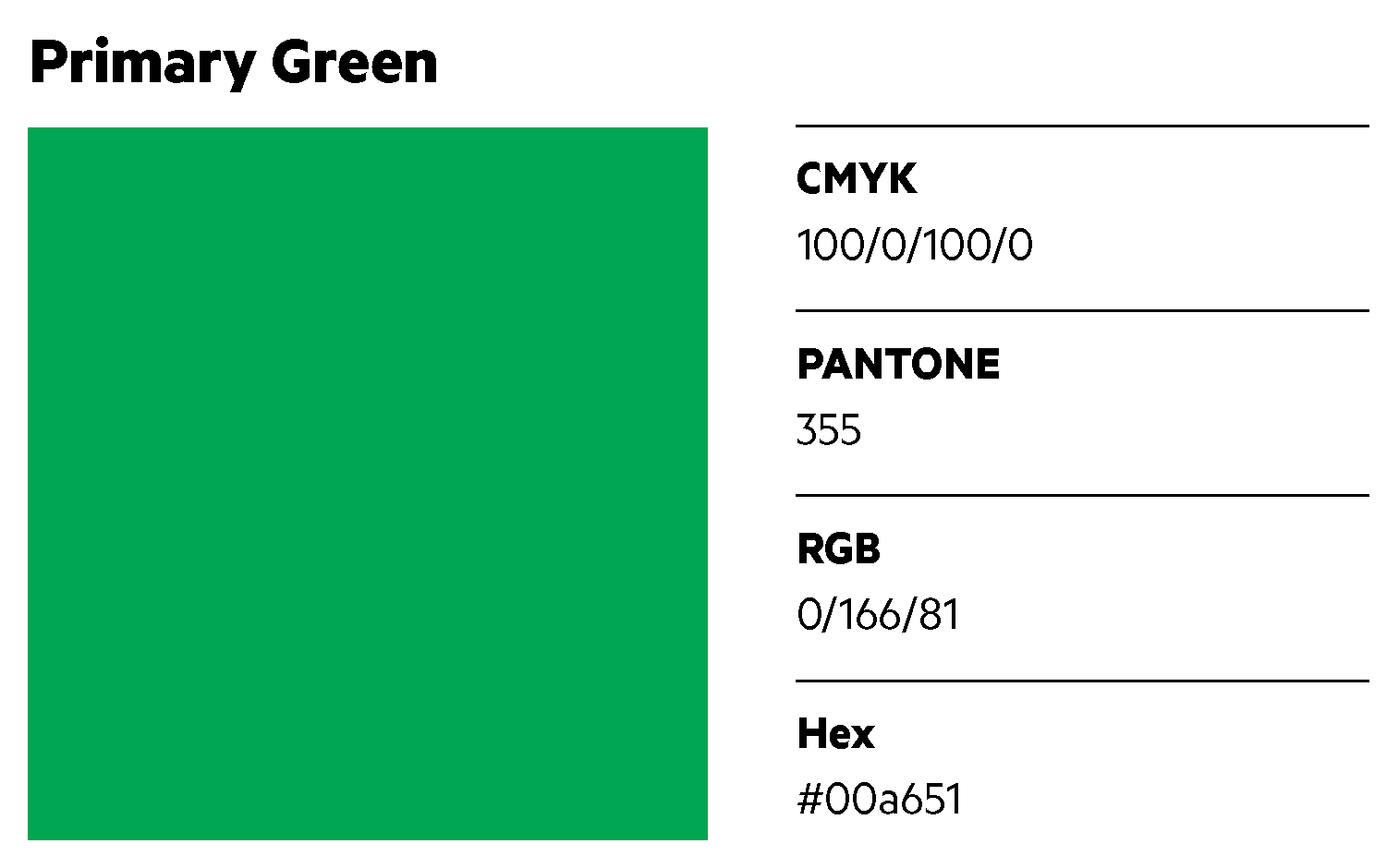
How is a CMYK formula built? Every print color is built using a percentage from 0-100% of each of the four process inks. Combining these four inks in different percentages will result in a multitude of different colors. The following formula is a simple example: C=100% M=0% Y=100% K=0% is 100% cyan, no magenta, 100% yellow, and no black. Building ink colors uses the same technique you learned painting in elementary school: blue + yellow = green. So, the CMYK formula above is a primary green. If you use a smaller percentage of each ink, a lighter green will result.

Pantone® Colors are an industry standard color matching system used for accurate color reproduction. Pantone® has created standardized formula guides with thousands of premixed inks for printers and designers to reference. If you provide a Pantone® color formula number to any printer, they can refer to the color guide and know the exact ink color you are requesting. This keeps your brand color consistent. For example, if you provide the vendor creating your brochures and the vendor producing your t-shirts the same Pantone® ink color 355, both vendors will use the same formula­ ­— and your final produced pieces will be the same primary green.

 

Color Modes Onscreen

RGB is used for any application on a screen. RGB refers to Red , Green , and Blue —the three colors of light used digitally on your computer screen, scanners, or digital cameras. RGB is additive color. All colors on your screen are built from a combination of these three colors. If you add all three colors together you will see white light.

Computers can display millions of colors, resulting in a larger color range than printing. Like CMYK, RGB uses numbers to build its formulas as well but since it has a wider color range, those numbers run from 0 to 255. So, the primary green we built above in CMYK would be Red =0 Green= 166 Blue=81 in RGB mode.

Hexadecimal (HEX) values are used in code by web programmers. HEX is based on RGB colors but converts the formula to a more compact format for the computer to understand. HEX uses a set of 16 symbols: 0-9 and A-F; colors are built by combining any 6 numbers or characters from that set. The HEX code for the green above is #00a651.

When we produce brand standard guidelines for our clients, we pay extra attention choosing color. We make sure the palette is an aesthetically complementary selection of colors which also includes a range of values that will accommodate a variety of usages. Therefore, our clients’ brand colors will be consistent across ALL forms of media.

Are you ready to create a new brand standard guide for your company? Contact us at Dever Designs today to start the conversation.
Templates Can Make Life Easier

Spencerville Adventist Academy (SAA) is a college preparatory school serving grades Pre-K through 12 in the greater Baltimore-Washington area. We created a new identity for them a couple years ago including a logo, a detailed brand style guide, signage, banners, e-newsletters, and photo display areas. Since then, we have partnered with SAA on various projects.

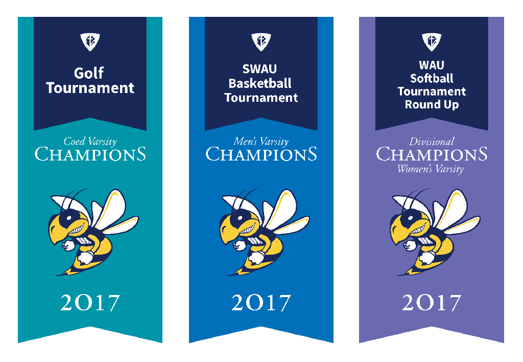
Recently, SAA asked us to create large banners for display in their gym celebrating their sports’ team championships. They want the banners to add school spirit and show students and visiting teams their legacy of success.

At Dever Designs, we always keep the clients’ needs in mind. We know that educational organizations have limited budgets, so we suggested a few options to help keep SAA’s costs down.

Always anticipate. We prompted the client to think ahead and carefully consider how these banners will be used in future years. The process began with a start-up meeting that included all the decision-makers to ensure that we understood the parameters of the project. We asked SAA many detailed questions, such as how these banners would integrate with existing banners in the school, what sports they would commemorate, where they would be placed, and how they would be hung to accommodate future championship victories. Taking time to think ahead ultimately saves time and money.

Set up a template. We created a template that SAA can use to build additional banners in-house. We suggested they utilize the resources available to them and enlist their student body and/or parents familiar with the software to volunteer their time to set up any future banners. To ensure consistent application, we developed a detailed set of guidelines and instructions on how to use the template to prepare the files for output. The banner template was designed to adjust easily depending on the amount of information on the banner. SAA has several athletic teams, so we designated a different color to each sports category. For example, all banners for the soccer tournament championships will be green, while those for the gymnastic championships will be purple. Over time, this will allow the client to minimize expenditures because they can layout subsequent pieces on their own.

Direct them to a vendor. To produce the banners, we introduced SAA to one of our trusted long-term vendors. This allows SAA to deal directly with the manufacturer on all future banners without having to go through us.

At Dever Designs, we work with our clients as a collaborative partner. If you have a project you need help with, please give us a call at 301-776-2812 to start the conversation.

A Conference Brand at Work

Dever Designs has been fortunate to work with Psychotherapy Networker for over 20 years, designing and producing their magazine and creating unique branding for their annual Psychotherapy Networker Symposium. Each year, thousands of therapists gather at the Omni Shoreham in Washington, D.C. to get the opportunity to recharge, reconnect, and learn from the masters in their field.

We start the process of branding the next symposium almost immediately after the previous one ends. Consulting with our clients, we establish a theme and create the appropriate graphic elements to build a brand for the event. Next, the look gets applied cohesively to pieces including ads, brochures, web elements, banner ads, promotional items such as tote bags and t-shirts, and a variety of event signage. We also help with other needs—from creating new exhibit hall displays, to finding a new photographer to document the event.

I work as a senior designer and project manager on our team. One of the perks of working with a client on their conference is getting to attend the event once all the planning and production work is complete. As a team, we get to experience the event for ourselves, see the crowds, spend time with our client, and see the impact of the various components we helped create.

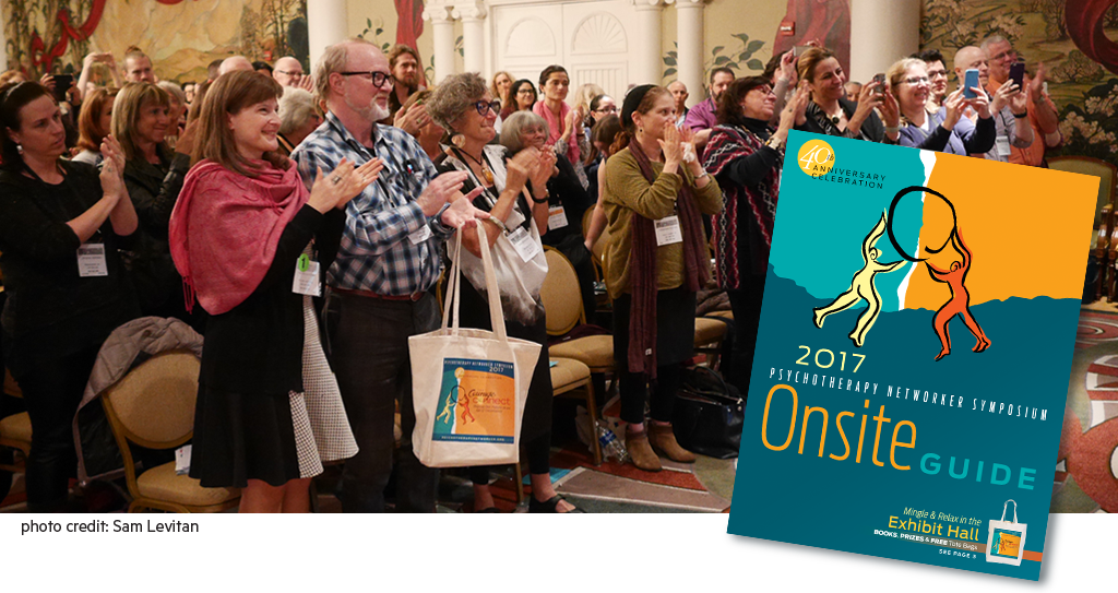
Branding long before the event results in larger attendance. This year’s symposium had a record-breaking crowd of 4,500 attendees. As I walked into the magnificent lobby of the hotel, the amount of people overwhelmed me. All of the effort we put into this event was now live and in action. I scanned the lobby to see how the pieces we designed for the conference fit into the space. The bright teal and gold colors of this year’s brand stood out in the large, ornate lobby. Several covers of the Onsite Guide in the same vivid colors were noticeable in attendee’s hands. The way-finding signage had the same bright appeal and was easily spotted in the expansive space.

The Symposium is kicked off with a large gathering to welcome the attendees. This session sets the tone for the rest of the symposium. Rich Simon, Editor of Psychotherapy Networker magazine, welcomed everyone to the 40th Anniversary Symposium with his customary wit and warmth. Drummers and dancers encouraged audience participation and sent us towards our different courses in high spirits.

The positive energy of the event continued in the workshops. I checked out a number of workshops to get a broad overview of the event and gain insight on how to help our client in the planning of next year’s symposium. I attended courses with captivating presenters who encouraged audience participation and interaction. More first-time attendees then ever before participated this year. I spoke to one new attendee who went to a local college and was excited to learn from all the amazing presenters. This energetic event is very important to therapists because they mostly work alone. A break from their practice to collaborate and learn from one another in such a positive environment is one of the many benefits of this conference.

I visited the Exhibit Hall, which was sold out and packed with people. A few years ago the exhibit hall wasn’t getting enough foot traffic to keep the booth vendors busy because the location in the hotel is difficult to find. Last year, we helped solve that problem by creating way-finding signage to direct traffic through the complicated hallways. This year, more floor graphics were added. Judging from the long line of attendees waiting for the exhibit hall to open, it didn’t appear that finding the exhibit hall was a problem any more. The hall felt much more open than last year, even though it had more booths then in previous years. We designed a number of signs and displays in the Exhibit Hall. Our array of signage provided a consistent look and feel and gave the expansive space some synergy.

The large crowd and positive energy of the event really shined throughout the long weekend. Everyone seemed so excited, ready to learn and experience what the Symposium had to offer. I think the bright and playful branding we did helped support the mood of the event.

A few days after the event, we attend a debriefing meeting with the client. We talk about successes, problem areas and what we can do to improve the event for the coming years to better serve the attendees. Our client was extremely happy with this year’s event. In fact, the Exhibit Hall was already sold out for next year before the event even ended. We can’t wait to get started on next year’s conference.

Call us today at 301-776-2812 to start the conversation about how we can help you with your upcoming conference.


What Is the Difference Between Vector and Raster Graphics?

Perhaps your designer just asked for a vector file of your logo, or you have a banner ready for output, but the printer insists that the graphics are too “low-res” and asks for high-resolution images. It sounds so complicated when you don’t comprehend the lingo, but it is simple to tell vector and raster graphics apart once they are dissected. Let’s take a closer look at these two graphic formats.

Both vector and raster graphics are used in printed pieces and digitally on screens, but they are built differently.


What are vector graphics?

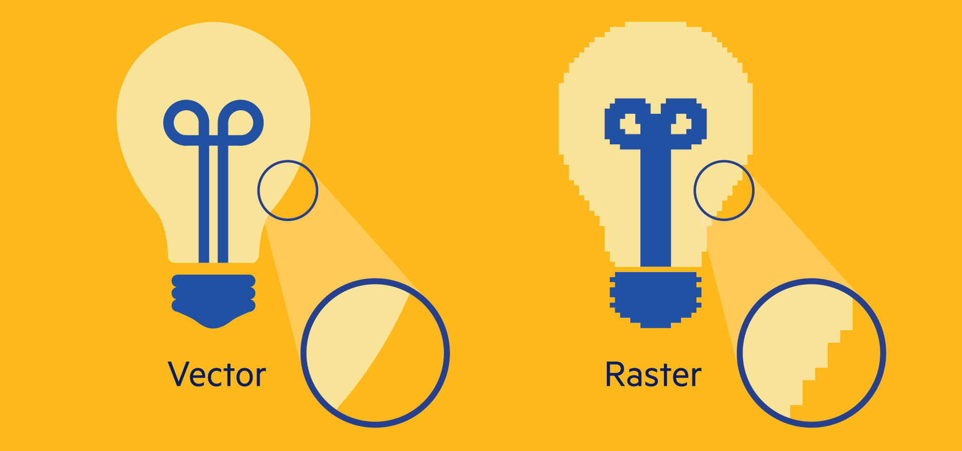
Vector graphics are created from mathematical paths, curves, and points. This produces a sharp, clear edge. Vector graphics are able to scale up or down infinitely without losing quality, so they retain the same crispness when printed on something as small as a business card or as large as a billboard. But, unlike raster graphics, vector graphics usually cannot achieve photo realism.

Fonts are the most commonly used vector graphics, and they demonstrate how well vector graphics scale. Look at the different sized letterforms below to see how the clean edge holds up at all sizes.


Where are vector graphics used?

Vector graphics are used in text, logos, illustrations, symbols, infographics, charts, and graphs. They are created and edited in computer programs such as Adobe Illustrator. Typical formats for a vector file are .ai (Adobe Illustrator file), .eps or .pdf. However, not all .eps or .pdf files are automatically vector-based. To understand why, we need to explore raster graphics.


What are raster graphics?

Raster graphics are made up of numerous of tiny squares called pixels. Each square represents a different color or lightness. These pixels are arranged in a grid. When zoomed out, this tightly woven grid creates a photograph or image.

The amount of pixels in an image determines its resolution. The more pixels an image contains, the more detail that is captured—and the higher its resolution; likewise, fewer pixels capture less detail and result in lower-resolution images. Resolution is measured by pixel dimension—the number of pixels that makeup the width and height of an image. A 480 x 270 pixel graphic is lower resolution than a 1920 x 1080 pixel graphic. If you’re not sure of your file’s pixel dimension, look at the file size, measured in kilobytes (KB) or megabytes (MB). Generally speaking, if a file is measured in KB, it’s low-res; if it’s 5 MB or more, it’s high-res.


Technically Speaking:

DPI and PPI are two terms that are used to reference raster graphic resolution. They are confusing because they have been used interchangeably, but they are not the same.

DPI – Dots Per Inch. DPI is used in the printing process, and it describes the number of dots a printed document has per inch. In a printed image the more dots, the higher quality the printed piece is.

PPI – Pixels Per Inch. PPI is used digitally, and means the number of pixels your digital image has per inch on your screen.


Where are raster graphics used?

Photographs and scanned images are the most common examples of raster graphics. Raster graphics often show more subtle changes in color, tone, and value than vector graphics are able to achieve. Unlike a vector graphic, it is impossible to take a small raster graphic and scale it up without losing image quality.

Raster graphics or images are captured by a digital camera or scanned into the computer and edited by programs such as Adobe Photoshop. Typical file formats include .jpg, .psd, .png, .tiff, .bmp, and .gif. However, both raster and vector graphics can be saved as .eps and .pdf.

So, how can you tell if an .eps or .pdf is really a vector graphic? If you don’t have Illustrator or Photoshop, you can zoom in on a file and check to see if the graphic retains a clean edge (vector) or becomes jagged (raster).

So, the next time you are asked to provide a vector logo to your graphic designer or a high-resolution image to your printer, you can relax because you know exactly what to give them.

If you have further questions about these graphic formats contact Dever Designs by email or call us at 301-776-2812.