Menu

Dever Blog

Color Me Consistent

Color Me Consistent

Once upon a time, there was a wonderful organization that did great things. To get noticed, they spent a lot of money with a world-renowned design firm that rebranded them and gave them pretty, new colors to use on all their identity and marketing materials. The organization wanted to spread the word, so they planned a large event and invited everyone to attend. But on the big day, not a single item they produced for the event matched! Everywhere they looked, their brand colors were different, and their celebration was ruined….

This sad tale may sound dramatic, but it’s true. Frustrated with vendors who, in their minds, reproduced their new brand identity “incorrectly”, this group contacted us for a brand audit to determine what went wrong. Our conclusion? The problem wasn’t the vendors; it was the colors. Specifically, no one had considered:
• in what applications the colors would be used;
• how and on what substrates the colors would be reproduced; or
• the client’s expectations for color consistency.

Recently, we discussed color modes and how they are used in graphic design. Attention to these basic principles would have prevented this costly error, so let’s take a closer look at how to choose and use color palettes.

Problem Palettes
At one time, designers were also production artists who had a fundamental understanding of how color was reproduced in print. As our deliverables have moved toward onscreen solutions, traditional means of color selection have given way to some extent to “pins” and online “themes”. More designers seem to be both relying on their software tools to define color and assuming that the resulting formula is the right one for whatever use is required; after all, Photoshop says so. While there is nothing wrong with finding inspiration beyond our Pantone® guides, depending solely on software-generated RGB or Hex formulas is a recipe for disaster when designing for cross-channel applications.

In our example, the new brand colors had to be reproduced in numerous applications: e.g., corporate stationery; direct mail; conference guides; promotional giveaways; exhibits; signage; email marketing; microsites; etc. Unfortunately, the colors seem to have been chosen based on how they performed online only; the client’s former designer did not take into account how each color would translate when:

  • printed on coated vs. uncoated stock;
  • printed on materials other than paper, such as fabric or vinyl;
  • printed with pre-mixed “spot” inks vs. four-color process ink builds;
  • output in RGB vs. CMYK color mode;
  • output via multiple devices utilizing different technologies;
  • viewed on backlit monitors vs. read as a printed piece.

The colors performed exactly as predicted—with dramatic differences in appearance in each of these scenarios—but because no one showed them actual color swatches or other visual samples of what to expect, the client was completely blindsided by the overall lack of consistency and the amount of variation in reproduction.

Spot and Process Inks Shown on Coated and Uncoated Paper

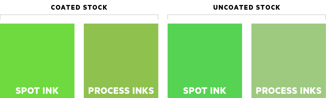
A single green color may look quite different when printed in spot ink vs. an equivalent build of process inks. Moreover, color also performs differently on coated and uncoated paper.


Too often, a palette is composed of too many colors. In the spectrum, these may be extremely similar to one another, so they become difficult to distinguish when used together—particularly at small scale. For example, a palette of green and blue may work fine, but an additional teal may be very close to either the green or the blue; when a palette like this is used in an actual project, it can look like a printing error or present additional challenges for audiences with color vision deficiencies.

Sample Palette of Green, Blue, and Teal


Dever Designs’ Palette Solution
When developing brand palettes for our clients, we make a narrow selection of colors based on all the ways they will be used. This basic palette is fleshed out with a range of values for each hue. Then, we provide 1–2 accent colors for situations that require extra “pop”. In this way, we can achieve greater depth and variety in application without producing a busy, circus-like effect and ensure that the brand will be consistent across all forms of media.
Do you need a truly functional rebrand or brand audit? Call us at 301-776-2812 to start the conversation.

Benefiting From A Collaborative Team

Team members' stacked hands


When you’ve been in business as long as we have, you develop a keen awareness of market trends: current design aesthetics, popular colors, technology adoption, preferred workflows…and much, much more. Everything is in flux, and many societal preferences are cyclical in nature. Not long ago, numerous organizations sought out “one-stop shops” that promised to handle all of their creative needs—from promotional writing and graphic design to data management and media buys. But the pendulum seems to be swinging the other way, with associations showing greater acceptance of—and even embracing—a collaborative team approach to achieve their goals.

What’s A Collaborative Team?
Individual experts in different fields working together in service of a common objective make up a collaborative team. An organization holding its annual convention might employ one trusted vendor to assemble and oversee a team consisting of a project manager, copywriter, graphic designer, printer, exhibit fabricator, web developer, etc.; each of these team members would be cherry-picked for their superior knowledge and skill to provide the best overall outcome.

Why Teams Work
Bringing together the right people from various disciplines generates multiple points of view on a given project. Assessing challenges from different perspectives creates a dynamic synergy among peers that leads to more effective solutions.

At Dever Designs, we recognize that we can’t be all things to all people…but we’re very good at what we do. Beyond providing thoughtful graphic design, we assemble and manage teams to execute large, complex projects ranging from websites to custom exhibit spaces. By partnering when appropriate with experts in other fields who share our passion for creative solutions that work and outstanding customer service, each party is empowered to focus on their strengths and be inspired by fresh ideas. Not only does this provide our clients with a first-string performance for every job, it also maximizes efficiencies of process that yield more bang for your buck.

Utilizing teams may offer benefits beyond working with the best and brightest. The large-scale retirement of baby boomers has led to many leadership positions being filled by much younger staff. These tech-savvy professionals can invigorate organizations but may lack experience or institutional knowledge of the design and production process. The resulting learning curves may make hiring a one-stop shop appealing…until you get their estimates. While larger agencies can command higher fees, smaller firms or niche specialists typically have lower overhead expenses than their “do-everything” counterparts. If your organization doesn’t have the resources to engage a mega-agency, teams can be a cost-effective alternative.

When offered to clients in complete transparency, forming a team of external partners can provide an effective, value-added experience for you and your audience.

Is a team-based approach right for you? Give us a call at 301-776-2812 to explore the possibilities and start the conversation.

Brand It, and They Will Come

Conference Branding


When you’re hosting a conference, you want to make an impact on your community of attendees and members. You focus on making your workshops educational and helpful. You pull out all the stops to book keynote speakers who draw crowds and inspire. You look at both the big picture and the details when it comes to the content of your conference, but what about its design and branding?

One way to make a big impact on both your marketing effort and attendee experience is to develop and implement a conference brand that is clear, unique, and instantly recognizable. Using consistent brand applications from the first point of contact—such as a save-the-date post card and email—through the on-site experience…to post-event surveys means that you’re building awareness, generating excitement, and fostering institutional pride and credibility at every step of the communication process.

So, what makes a successful conference brand? For starters, it’s more than a logo. The best conference brands are packages that include flexible graphics that can be applied across every medium. From direct mail to t-shirts, on-site signage to slide decks, consistent and expertly applied graphics, colors, and type treatments go a long way to build recognition and set a professional tone for your conference.

Next, your theme language is every bit as important as the graphics but is often overlooked and undervalued. While some go for a clever turn of phrase, it’s important to think about how your language addresses your audience’s pain points. Help them see the benefits that your conference provides and give them a sense of the atmosphere of the event through the tone and choice of your words.

Call us today at 301-776-2812 to start the conversation about how we can develop a conference brand that makes your organization stand out in the crowd.