Menu

Dever Blog

An App with a Purpose

mockup


We believe the right time to build an app is when it can be useful for your audience by promoting engagement and solving a problem.

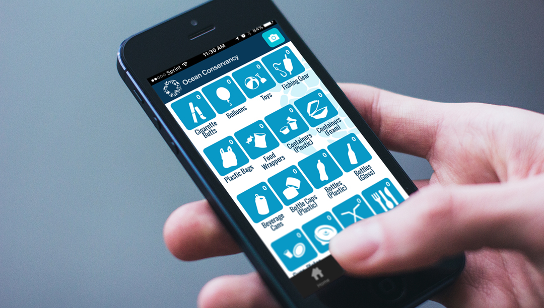
Clean Swell, an app by Ocean Conservancy, does just that. During annual cleanups and throughout the year, volunteers had to fill out thousands of paper data collection forms and add up the totals themselves. To help streamline that process, Ocean Conservancy created an app to allow users to tap on an item collected and automatically keep tallies. The data collected instantly uploads to Ocean Conservancy’s global ocean trash database. This data delivers a global snapshot of ocean trash, providing researchers and policy-makers insight to inform solutions.

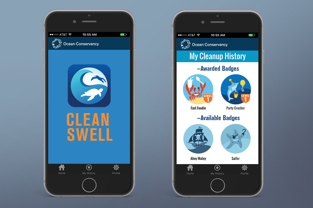
Dever Designs was initially tasked with the creation of the main app icon along with buttons representing the range of trash found on beaches. With a more recent update, we had the opportunity to illustrate whimsical badges that can be earned by the users for certain quantities and types of trash collected. This “gamification” encourages volunteers to gather more trash in order to achieve higher levels within the app.


mockup2


While working on the graphic icons and elements for CleanSwell, we focused on creating pieces that fit within the Ocean Conservancy brand and tied through to the Global Trash Index Report we designed. This creates a continuity between the users’ experience in the app and their other interactions with the Ocean Conservancy.

We were proud to partner with Ocean Conservancy on an app that empowers people to take action in contributing to a cleaner and healthier ocean.

See more of this project here.

How can we help bring your brand to life? Email or call us at 301-776-2812 to start the conversation.

Project Highlight: Going Global with “Adventist World”

AW_Friendship_Covers_v2


Dever Designs may be a mid-sized design house in Laurel, Maryland, but it’s exciting to know our impact can be felt around the world. Some 10 years ago, we designed a prototype for Adventist World, the magazine for the Seventh-day Adventist world church. Today the magazine is printed in seven languages, reaches five continents, is published online in 12 languages, and has a monthly circulation of 1.5 million.

Project Background
Adventist World is a 32-page monthly publication that reaches a diverse demographic spanning the globe. The publication has a warm, personable and aspirational look and feel. A traditional layout features evergreen content printed in multiple languages.

Fun Fact: We were initially asked to design a magazine prototype, which successfully evolved into a 10-year relationship designing the publication. In May, we designed a customized “Friendship” issue of the magazine which included 27 editions in four languages for 13 world divisions.

Challenges of Going Global
While Dever Designs has an exceptional background in publication design, producing a global publication is an extraordinary undertaking in many ways:

• It requires working with translators in several countries to modify the content before it is reconfigured into the design.
• Great design work means purchasing affordable art and rights across multiple editions.
• Keeping writers, editors, designers and other team members in the loop is challenging, so we utilize the cross media publishing platform vjoon K4 to keep everyone on track.

Why It Works
All great relationships require trust and respect. One of the things we and our clients find mutually beneficial is the opportunity for honest feedback.

“At Dever Designs, we’re neither divas who have to have it our way, nor are we doormats that say, ‘yes, we’ll do whatever you want’,” Jeffrey Dever said. “We challenge our clients to help them meet their goals. We’re not afraid to push back about things that can’t or shouldn’t realistically be done.”

Staying Passionate
One of the main things that helps us stay passionate, especially after 10 years of working together, is the excitement and passion of the client and just how much the client affirms our staff and our team.

“You can tell how they really appreciate everything my team does for them and that proactivity,” Dever said. “Having a client who really values the work we do keeps us engaged.”

See more of this project here.

Interested in learning more about our work? Visit us at deverdesigns.com or call us at 301-776-2812.

Design in the Details: NAD Exhibition


For their 60th quinquennial session in San Antonio, Texas, this division of the Seventh-day Adventist Church enlisted Dever Designs to conceive, create, and produce a major exhibition. The goal was to feature how their diverse range of ministries reflected the theme Reaching North America – With Hope & Wholeness. The nearly 30,000 square feet exhibit was designed to focus on three areas of concentration – departmental ministries, media ministries, and a gallery of education. Overall, we designed and coordinated the construction and installation of over 50 separate exhibit components for more than 40 internal clients. The key to the project’s success was careful design, attentive project management and focused logistics coordination.

Take a look at the range of trade show exhibits that we’ve designed in our portfolio.

To see how Dever Designs can help you with your trade show exhibit, get in touch today.

Creating a Client Media Kit—Why Less Is More

IACP.blog_View.02.Dual


You’ve all heard the saying, “less is more.” It’s a useful concept in the world of graphic design and one we have often applied to best serve our clients.

When we were hired by the International Association of Chiefs of Police (IACP) to design their new media kit, one of the first things to be addressed was the text-heavy nature of the content. Too many words made the information seem overwhelming and left little room for visual relief. Paring down the text allowed us to repackage the most salient points as
•    Interesting Statistics
•    Colorful Infographics and
•    Powerful Testimonials

The updated presentation improved the overall clarity of their messaging and better engaged readers and advertisers.

Removing all dates and time-sensitive material from the main portion of the kit gave the piece a multi-year shelf life; date-specific information was presented in a separate rate card housed in a pocket at the back of the kit. This approach enabled us to provide our client with additional cost savings by not forcing them to update the entire media kit annually.

While this redesign was not intended to be a complete rebranding effort, our client did share the challenges they faced in having many different departments that each presented their own look and feel. So, working within our budget, we designed this kit with imagery and visual cues that served as a foundation on which they could build their brand. For example, photographs of flashing police cruiser lights were manipulated and cropped to transform a literal symbol of policing into an abstract texture with color and energy. Using this art as a gradient stripe elevated a traditional visual into something less intimidating and more modern. Repurposing the various elements and colors in other applications helped establish a sense of cohesiveness in subsequent IACP messaging.

The overall result? We transformed an information-heavy piece into an attractive and engaging kit and set the stage for a stronger, more enduring brand.

Check out what we did for the IACP here. To see what Dever Designs can do for you, give us a call at 301-776-2812.